Why ad-hoc Tailwind fails at scale
Tailwind's utility-first approach is genuinely faster than writing CSS from scratch — until a project grows past the initial sprint. Without a system, you end up with `text-slate-700` in one component and `text-gray-600` in another, `px-4 py-2` buttons next to `px-3 py-1.5` buttons, and a color palette that nobody can reconstruct from the codebase alone. These are not style inconsistencies — they're decision inconsistencies, and they accumulate into maintenance debt.
The problem is that Tailwind's strength (granular control) is also its weakness at scale. Every developer on the project has full access to the full palette, spacing scale, and typography scale — and without explicit constraints, they'll use different subsets. The design system is the mechanism that collapses this decision space: instead of choosing between 50 shades of gray, developers choose between `text-muted` and `text-body` and `text-heading`.
The solution is not to abandon Tailwind for a component library. Pre-built component libraries (Chakra, MUI, shadcn) are excellent for internal tools and prototypes but create friction in production work because the design language is fixed and customization fights the library's assumptions. Tailwind with a well-designed system gives you full design control with the development speed benefit of utilities.
- Define semantic color names in tailwind.config.js before writing a single component.
- Never use raw palette values (`slate-700`) in component files — always use semantic tokens.
- Create a brand token file that a designer can update without touching component code.
- Document the design system in a Storybook or a simple component showcase page accessible to the whole team.
- Audit the codebase for inconsistent spacing and color usage at the end of every sprint.
Design tokens: the foundation of a consistent UI
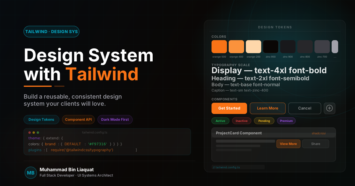
Design tokens are named values that represent the design decisions of a system — colors, typography, spacing, border radius, shadow, and animation. In Tailwind, tokens live in `tailwind.config.js` (or a `tailwind.config.ts`) in the `theme.extend` section. The key distinction is between primitive tokens (the raw values: `blue-600: '#2563eb'`) and semantic tokens (the intent-mapped values: `primary: '#2563eb'`, `brand-action: '#2563eb'`).
Always define semantic tokens as the primary interface for developers. `bg-primary` is a stable API that a designer can remap to a different hue without any component changes. `bg-blue-600` is a direct palette reference that requires find-and-replace when the brand color changes. For production systems where brand updates are inevitable, semantic tokens are not optional — they're risk management.
Extend the Tailwind default scale rather than replacing it. Adding `primary`, `secondary`, `muted`, `success`, `warning`, and `destructive` color tokens gives developers a working vocabulary for the design system without removing access to the full Tailwind palette for edge cases. Use CSS custom properties (CSS variables) as the underlying implementation so that token values can be updated at runtime for dark mode and theming.
Typography tokens deserve the same treatment as color tokens. Define `font-heading`, `font-body`, and `font-mono` in the theme rather than referencing specific font families in components. Define `text-xs` through `text-4xl` with explicit `lineHeight` and `letterSpacing` values for each size rather than relying on the defaults — this ensures consistent text rendering across browsers and components.
- Define semantic color tokens (`primary`, `secondary`, `muted`, `destructive`) before any component work.
- Implement tokens as CSS custom properties so they can be swapped at runtime for theming.
- Separate primitive tokens (raw values) from semantic tokens (purpose-mapped values) in your config.
- Define explicit line-height and letter-spacing for each typography scale size.
- Add an `animations` object to your Tailwind config with named animations rather than inline `animate-` utilities.
Component patterns: variants without CSS-in-JS
The standard approach for Tailwind component variants in React projects is the `cva` (class-variance-authority) library. cva lets you define a component's base styles and a set of named variants (size, intent, state) using a type-safe API, then generates the correct Tailwind class string based on the props passed. This gives you the ergonomics of a component library's variant system without any runtime CSS generation.
A Button component using cva would define its base styles (`inline-flex items-center font-medium transition-colors focus-visible:outline-none`), a set of `intent` variants (`primary`, `secondary`, `ghost`, `destructive`), a set of `size` variants (`sm`, `md`, `lg`), and a default variant for each axis. The component accepts typed props that map to variants, and cva handles class merging and conflict resolution.
Class merging conflicts are the most common source of bugs in Tailwind component systems. The `tailwind-merge` (twMerge) library resolves conflicts between Tailwind utility classes — when two utilities target the same CSS property (e.g., `text-blue-600` and `text-red-500`), twMerge ensures the last one wins rather than both being included and the winner being determined by stylesheet order. Always compose cva with twMerge in your component's className construction.
Slot-based composition is the pattern for building compound components in Tailwind without prop explosion. Rather than passing every style detail as a prop, expose `className` slots for each sub-element of the component. A Card component might expose `className` for the card root, `headerClassName` for the card header, and `bodyClassName` for the content area. This allows callers to extend styles without the component author needing to anticipate every use case.
- Use `cva` (class-variance-authority) to define component variants with typed props.
- Always compose cva with `twMerge` to prevent Tailwind class conflicts when extending component styles.
- Define `intent` and `size` as the two primary variant axes for interactive components.
- Expose `className` as a prop on every component for extension — but document that it merges, not overrides.
- Colocate component styles in the component file, not in a separate styles file — the utility is self-documenting.
Dark mode implementation that actually works
Tailwind's dark mode support via the `dark:` variant is straightforward to enable but easy to implement incorrectly. The two strategies are `media` (respects the user's OS preference automatically) and `class` (requires adding/removing a `dark` class on the root element, allowing explicit user override). For production applications that need a dark mode toggle, the `class` strategy is required — with the user's preference persisted to localStorage and applied synchronously before the page renders to prevent a light-to-dark flash.
The flash-of-incorrect-theme (FOIT) problem is the most common dark mode bug. It happens when the theme preference is read from localStorage after React hydration — causing a visible flash from the default (light) theme to the saved (dark) theme. Solve it with an inline script in the HTML head (before any React code) that reads localStorage and applies the `dark` class to the root element synchronously. In Next.js, inject this script in a root layout's `<head>` using a `<script dangerouslySetInnerHTML>` tag.
Semantic color tokens are what make dark mode maintainable. If you've defined `text-primary` as `text-slate-900` and `dark:text-primary` as `dark:text-slate-100`, swapping dark mode throughout the entire application is a one-line change in the token definition. If instead you've used `text-slate-900` and `dark:text-slate-100` directly in 200 component files, a design update requires touching all of them.
Test dark mode on every new component as you build it — not as a post-build exercise. Dark mode bugs are invisible in light mode and tend to accumulate until a production incident. Add a dark mode toggle to your local development environment and keep it toggled while building. Test with both a dark OS preference (to verify the media query fallback) and with the explicit toggle (to verify the class-based override).
- Use the `class` dark mode strategy and persist the preference to localStorage.
- Inject a synchronous theme script in the HTML head to prevent flash-of-incorrect-theme.
- Define all dark mode values at the token level — never in component files.
- Add a visible dark mode toggle to your development environment and keep it on while building.
- Test dark mode with the system preference, the explicit toggle, and after a hard refresh.
Consistency at scale: linting, documentation, and handoff
A design system without enforcement is a suggestion. ESLint plugins for Tailwind CSS (`eslint-plugin-tailwindcss`) catch common mistakes: unsorted class names (enabling Prettier's Tailwind plugin for automatic sorting), deprecated class names, and invalid class references. Adding these to the project's linting setup ensures that style inconsistencies surface in code review rather than in production.
Storybook is the gold standard for design system documentation, but it has a significant setup cost. For smaller projects, a simpler approach is effective: a `/design-system` route in the app itself that renders every component variant side-by-side. This is faster to maintain, requires no build tooling beyond what the project already has, and is accessible to designers and stakeholders through the same URL as the app.
Handoff documentation for any project should cover: the semantic token dictionary (what each token means, not just its value), the component API (what variants and props each component accepts), and the extension pattern (how to add a new variant to an existing component without breaking existing usage). Keep this documentation in the repository as a Markdown file or a Storybook story — not in a Confluence page that will drift out of date.
When a production system is handed to a new engineering team, the design system documentation is the most valuable asset you can leave them. A team that understands the token system can extend the UI confidently. A team that inherits undocumented utility soup will rewrite the styling from scratch within six months, negating all the consistency work done during the original build.
- Add `eslint-plugin-tailwindcss` and Prettier's Tailwind plugin to every project's tooling setup.
- Build a `/design-system` showcase route that renders every component variant — update it with every new component.
- Document the semantic token dictionary with the purpose (not just the value) of each token.
- Include a 'how to extend this component' section in the handoff documentation.
- Run a visual regression test (Chromatic or Percy) on the design system route in CI to catch unintended style changes.
Share this article
Help others discover this resource and extend the reach of the content.